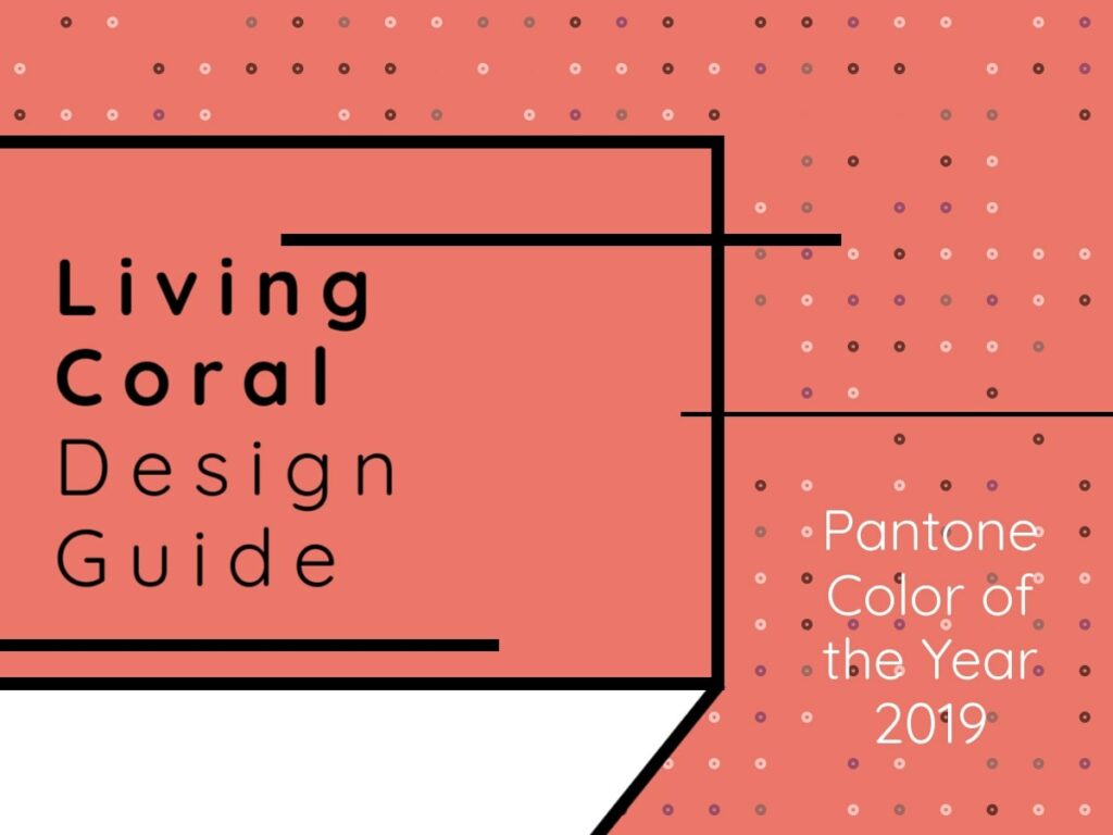
Each year since 2000, the Pantone Color Institute decides on a “Color of the Year.” Pantone strongly believes in the importance color plays in our lives, and “the Color of the Year selection process requires thoughtful consideration and trend analysis.” The 2019 Color of the Year is PANTONE 16-1546 Living Coral, a “vibrant, yet mellow” hue which, “embraces us with warmth and nourishment to provide comfort and buoyancy in our continually shifting environment.” This year’s color is further described by Pantone as “sociable and spirited,” a shade that “welcomes and encourages lighthearted activity,” symbolizes our “innate need for optimism and joyful pursuits,” and “embodies our desire for playful expression.”
Sounds like we all could use a little more Living Coral in our lives! Pantone’s Color of the Year is influential in design across multiple industries, so 2019 is sure to spotlight this vivid coral color. We’ve already seen this color in brands such as Airbnb, but what does this exciting announcement mean for your business? Here’s how to stay on-trend and successfully incorporate Living Coral into your brand design.
1. Use Coral To Enliven A Gray Palette
This year, we are seeing a shift from all-neutral palettes to more whimsical palettes that are injected with color. While this fun and vibrant trend works very well for some companies, it might not be everyone’s cup of tea. If you want to dip your toes in the bright color arena, but still wish to keep things elegant and understated, consider combining gray and coral. Coral will inject one of our favorite, always-chic neutrals with the perfect pop of color so your branding can really shine. The warm, fiery coral will perfectly complement the cooler gray, resulting in a dramatic impact that will surely get your branding noticed.
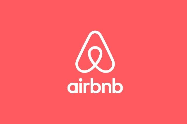
Airbnb uses neutral gray, crisp white, and fiery coral on their website for a professional and stimulating result. Their unmissable coral logo evokes a feeling of confidence within the viewer, as well as enthusiasm—perhaps an enthusiasm for their next adventure with Airbnb!
2. Use Vivid Coral On Your Brand’s Web Pages To Highlight Key Actions
Attention-grabbing coral is perfect for use as a spotlight color on your website. Incorporate this striking shade wherever you want to place emphasis. Use coral within your CTA’s to capture the interest of visitors and strategically direct their attention. Coral will be just as visually appealing as it will be effective, and it will certainly help to keep your brand’s online presence on-point in the new year.
Again, Airbnb has harnessed the power of coral by using the bold color on their important CTA buttons. Their “Search,” “Book,” and “Contact” commands are just a few of the CTAs displayed on an unmissable coral button.

3. Opt For Coral And Blue On Your Business Cards
Warm coral and cool blue are considered two of the most beautiful colors found in nature. Think of bustling coral reefs amidst refreshing clear blue waters, or a pink flamingo against a cloudless summertime sky. When combined, blue and coral evoke a feeling of playful tranquility. Calming and optimistic, fresh and cheerful, using this color combination will certainly start your brand off on the right foot with any client.

4. Go All Out And Use Vivid Coral As Part Of A Bright, Multicolored Palette
Bold color combinations are increasing in popularity among plenty of brands that want to let consumers know just how fun and fabulous they are. Creative brands especially are harnessing the power of color to tell their story. Whether it’s through your social media, your website, your signs and stationary, or all of the above— amping up your color game could make your brand the victor when it comes to getting noticed.
LA-based lifestyle brand Ban.do are pros at making colorful, candy-coated dreams a reality through their charming branding. Whether you’re scrolling through their energetic Instagram feed, browsing their pretty pastel website, or ogling one of their stylish products, you’ll be transported to a world of multicolored magic that you’ll instantly want to be a part of. Take a cue from Ban.do and dive headfirst into a daring (and darling!) color spectrum.

5. Combine Coral And Green For Earthy Excellence
The color green is found throughout nature and represents renewal and growth. It also has a calming affect that is great for brands who want to evoke trustworthiness or confidence from their consumers, and—let’s be honest— don’t we all? Likewise, coral is also found in nature, and strengthens feelings of safety and happiness. Together, serene green and passionate coral create the perfect harmony of earthy, robust colors.
Use hints of coral across a green palette to energize your look. This combo works especially well for organic, or natural companies that want to convey an earthy feel that is also on-trend and captivating. Green Destinations, a non-profit organization focusing on sustainable tourism around the globe, uses shades of green alongside coral for a well-balanced and youthful look.

6. BONUS: Use Coral On Social Media To Awe Your Audiences
“Living Coral is going to be social media catnip on the heels of Millennial Pink and Gen Z Yellow,” says Shirin Majid, executive creative director of Cake UK. “It fits the lighter, escapist side of our #currentmood, and I can see brands using it in eyeball-grabbing social content and live ‘grammable’ experiences and backdrops for an instant modern refresh.”
Skincare and makeup brand Glossier used coral for a recent installment in their LA shop. Glossier Canyon is “an immersive, custom-designed room inspired by Arizona’s Antelope Canyon—complete with day-to-night lighting and real-life desert sounds.” The intense corals of the canyons make the perfect bait for social media fiends, and the ideal backdrop for seasoned selfie lovers who yearn to be shown in their best light.

We have a feeling that 2019 will bring plenty of exciting coral-colored developments our way, and we can’t wait to enjoy them! How do you feel about pantone’s 2019 color of the year? Are you ready to incorporate it into your branding?
Did you know: VisualFizz is recognized as a top Illinois Web Design Agency on DesignRush!
We believe design is a critical component of branding. From your logo to your website to your social media channels, everything should match perfectly. View more of our design work here.
Publishing Date: