
Branding a City – Melbourne, Australia
Branding a city is far different from branding a product. It has its own separate set of challenges associated with it; you’re essentially trying to encapsulate an entire place in a single image, word or slogan which can be very difficult to achieve as cities are multidimensional and ever changing, so it’s hard to sum them up in such a short and succinct way without it backfiring. It can potentially come across as fake or pretentious, which can significantly affect the public’s perception of the place.
But there are definitely ways to brand a city successfully, and there are times when rebranding has worked wonders for a city. Melbourne is a great example of a place where it really worked. Ten years ago, Melbourne underwent a significant overhaul of their brand, which was one of the most successful municipality branding projects completed by a private company.
So the real question here is, how was Landor, the company tasked with delivering this project, able to achieve such success? Take a look below as we pinpoint exactly how they were able to nail it.
Researching and Understanding Melbourne’s Population
One of Landor’s biggest challenges was that they weren’t local. Though they are an Australian company, they were actually based in Sydney, so they had to get to know the real Melbourne and understand it, in order to succeed. They did this by carrying out extensive research in the initial stages of the rebrand project.
They interviewed internal and external stakeholders, held workshops and audited their branding ideas regularly. They were able to build a pretty good picture of what came to various people’s minds when they spoke or thought of Melbourne.
Capturing Melbourne in a Single Image
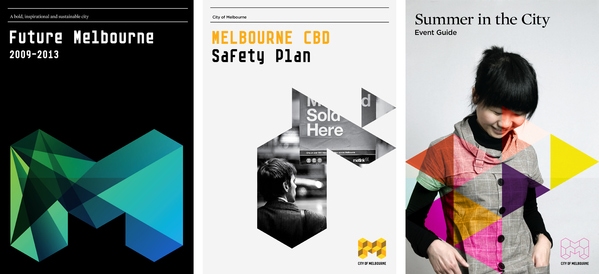
One of the most impactful changes that the City of Melbourne made was to their logo. In fact, this was the main focus of their rebrand strategy and was at the forefront of their thinking.
After receiving a lot of feedback regarding their previous leaf logo, they concluded that the image had become significantly outdated and no longer accurately represented Melbourne’s vibrant and ever changing scene. After all, the design was created 15 years prior, in the mid-nineties. A lot has changed since then.
The new logo that they created was not only more modern, it was far more vibrant and fun; reflecting what kind of place it wanted to be known as.
The logo was set to be the core piece of Melbourne’s rebrand, so the project’s success was highly reliant on it. Not only that, with a price tag of $200,000, the residents of the city had high hopes for it and a little angst over the cost.
Nevertheless, they succeeded. They defined an audience that they wanted to target, which can always be difficult when branding a city because you want to appeal to everyone, but can’t. There’s a lot of positive feedback on design forums and articles that praise the success of the ‘M’.
![]()
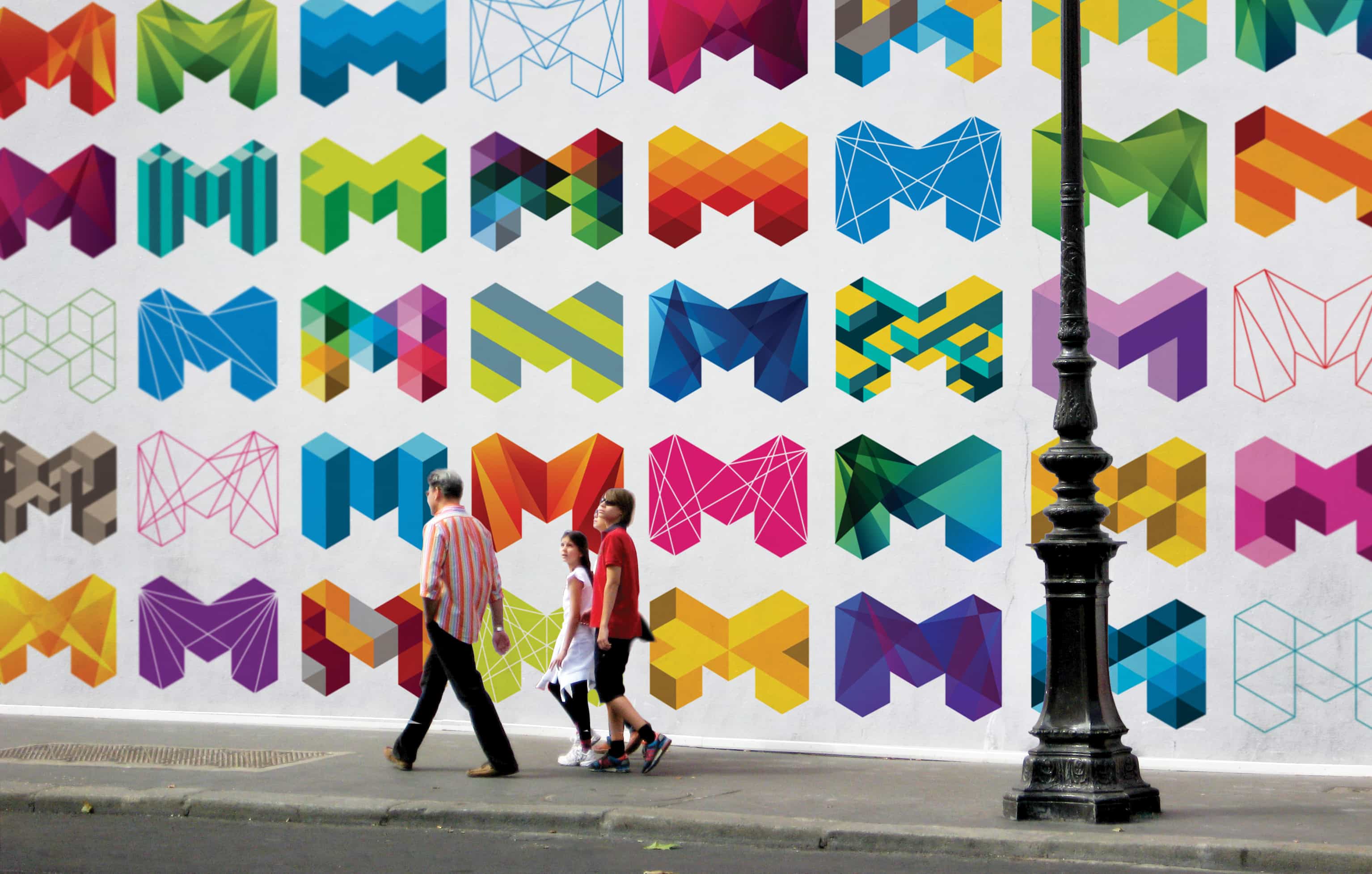
Melbourne’s Ingenious Dynamic Logo Explained
One of the most memorable and unique aspects of their logo is how versatile it is. There are countless geometric shapes used for different ‘M’ logos and the colors are dynamic and bold. The one color ‘M’s focus on using different shades of the color and they manage to create a more sophisticated and professional looking M which works well for corporate organizations wanting to incorporate the city’s municipality branding to their business.
The sharp fonts used help to symbolize the fact that Melbourne is a cutting-edge city and its versatility allows easy integration for any kind of business in the area. It was also a refreshing change to see some different fonts from ones that most cities go for (usually a lowercase serif, like Amsterdam).
As someone who has visited the city of Melbourne, I would describe it as a very fun, vibrant and diverse kind of place. Landor managed to really encompass the city’s feel with their logo through both the geometry of the M and the vibrancy of the palette. It truly represents everything that Melbourne is about.
Branding through Flexibility in Design
One of the must haves with creating this branding for Melbourne was that it had to leave room for growth and change in the future as well as some form of creative freedom for companies that wanted to work with the city of Melbourne.
This is a very modern approach when it comes to successful branding as it ditches the traditional thinking that you should create something rigid that doesn’t grow and change as your city does. By creating something that allows more flexibility, you won’t need to completely overhaul your city branding every few years; which would be both expensive and time consuming.
Ten years has passed since the ‘M’ first graced the streets of Melbourne, and since then, it’s managed to achieve a level of flexibility that’s allowed it to develop gradually over the years without significantly having to change. The logo still looks modern and the city of Melbourne continuously experiments with new color schemes and shapes that accurately depict what it’s like to live or travel in the city.
Branding through Authenticity
Those of you who are familiar with the city of Melbourne and take the time to look at their branding and logo thoughtfully will realize how well they’ve managed to nail it by depicting an accurate representation of the city using imagery.
Though the ‘M’ itself isn’t something that will make tourists want to flock to Melbourne in the masses, speak to any local of Melbourne and they’ll likely agree that it says a lot about their city and is a true reflection of their community.
Contact VisualFizz to learn more about branding for cities, government bodies, and municipalities.
[Form id=”1″]
Publishing Date: