Existing client Prairie Materials came to VisualFizz for help with a ground-up branding initiative and product launch. The VisualFizz team needed to devise a creative solution that checked all of the following boxes:
- Launch a new product without disrupting the existing consumer base
- Introduce a new concept into an industry that has seen marginal changes over the decades
- Develop a go-to-market strategy that successfully generates interest and excitement with stakeholders with highly varying needs and goals
- Ensure alignment across a diverse internal team
Learn how VisualFizz partnered closely with Prairie Materials to create an identity for their new brand and equip the Prairie Materials team with everything needed to successfully launch to the public.
This case study covers the following services provided by VisualFizz:
About Prairie+ and Client Challenges
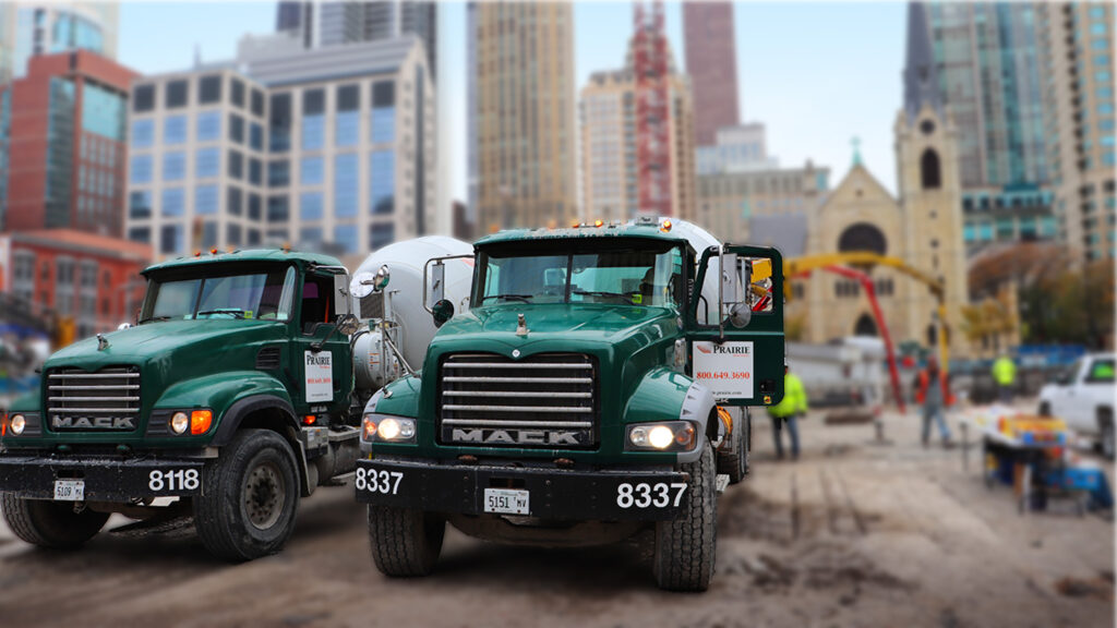
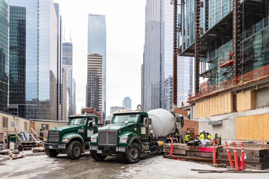
Prairie Materials is a successful building materials business that’s been around since 1948. Owned by parent company Votorantim Cimentos (one of the world’s largest cement companies), Prairie Materials was getting ready to launch a new sub-brand: an environmentally friendly ready-mix line.
The new brand will fall under the Prairie Materials umbrella while still maintaining its own identity. The goal is for it to support the overarching brand without cannibalizing its customer base.
Prairie+ is a low-carbon, low-water-usage lime mix that provides additional environmentally positive impacts and will have a long brand life. By launching a sub-brand focused on reducing its carbon footprint and CO2emissions, Prairie Materials will be able to further differentiate itself from its competitors and give consumers an additional premium offering.
VisualFizz’s Solution
A great new product or brand needs an equally fantastic and thoughtful brand identity and go-to-market plan.
Prairie Materials needed help defining their new sub-brand. What does it mean to existing and future customers? How does it tie into sustainability as well as their core values and mission? And finally, how should Prairie Materials launch it to the public in a way that supports overall business goals?
VisualFizz jumped at the opportunity to take on this challenge. The project turned out to be three-pronged in approach, with VisualFizz providing the following services:
- Branding, including visual identity, positioning, and messaging
- Go-to-market strategy
- Sales enablement materials
VisualFizz ideated and executed a brand identity and an extensive go-to-market strategy, including a full suite of sales and training materials for internal and external audiences.

Comprehensive Branding Services
Creating a new brand is a complex process. VisualFizz took a methodical approach to developing a thoughtful and enduring brand for Prairie Materials’ new eco line. Branding services encompassed research and discovery, visual identity, and brand positioning and messaging.
Stakeholder Interviews & Market Analysis
To begin gathering insights and information, VisualFizz met with staff across the entire Prairie Materials ecosystem: the executive team, sales, and tech services.
VisualFizz learned about Prairie’s eco line of products and the conversations that were developing around sustainability. We discovered their challenges, where they want to be, what’s in the market right now and the types of obstacles they’re facing.
Here’s a sample of the types of questions VisualFizz asked stakeholders:
- Executive Team:
-
-
- How would you position the mission or value proposition for this division?
- What factors do the most important customers value?
- What are the foreseen biggest challenges with this line?
-
- Sales:
-
-
- Who are the customers and projects?
- What’s most important to them?
- What do you need to feel supported when pitching this new line?
-
- Tech Services:
-
- How will product growth be determined?
- How are products developed?
- What makes Prairie+ unique and different from other similar brands?
In addition to gathering information with internal employees, VisualFizz performed a SWOT (strengths, weaknesses, opportunities, threats) analysis of top competitors. This robust background on the competition helped VisualFizz create clear-cut opportunities for Prairie Materials’ new brand moving forward.
The team then developed primary and secondary target audience personas with demographics and values to help shape name and messaging development.
Brand Name Ideas
VisualFizz brainstormed and landed with several categories to explore, including eco, bio, carbon, adapt, impact, enviro, sustainable, green, prime, materials, and Prairie. The team started broad and developed 15 names per concept before paring it down to the top 4 options, each presented with rationale.
THE WINNER: Prairie+
Prairie+ nods to the trusted Prairie Materials brand and leans on its reputation and strength. The plus sign helps the name stand out as fresh and innovative, and it references additional product offerings and exceptional service that goes above and beyond expectations.
Other Name Ideas and Rationale
- EcoPour – Process-oriented. It combines eco-friendliness with the concept of pouring real material.
- EcoBuild – Solutions-oriented. It combines eco-friendliness with “Build,” which has many uses (building, builder, building a future) in the ready-mix industry.
- Envirosolutions – Process- and solutions-oriented. “Enviro” references how all solutions are developed with the impact of the environment in mind to deliver a positive/neutral “enviro” result.
Logo Concepts
Once a name was chosen and messaging work was underway, VisualFizz began concepting ideas for the logo design. The team developed multiple logo options that explored a variety of colors, fonts, icons, and visual hierarchies.
![]()
THE WINNER
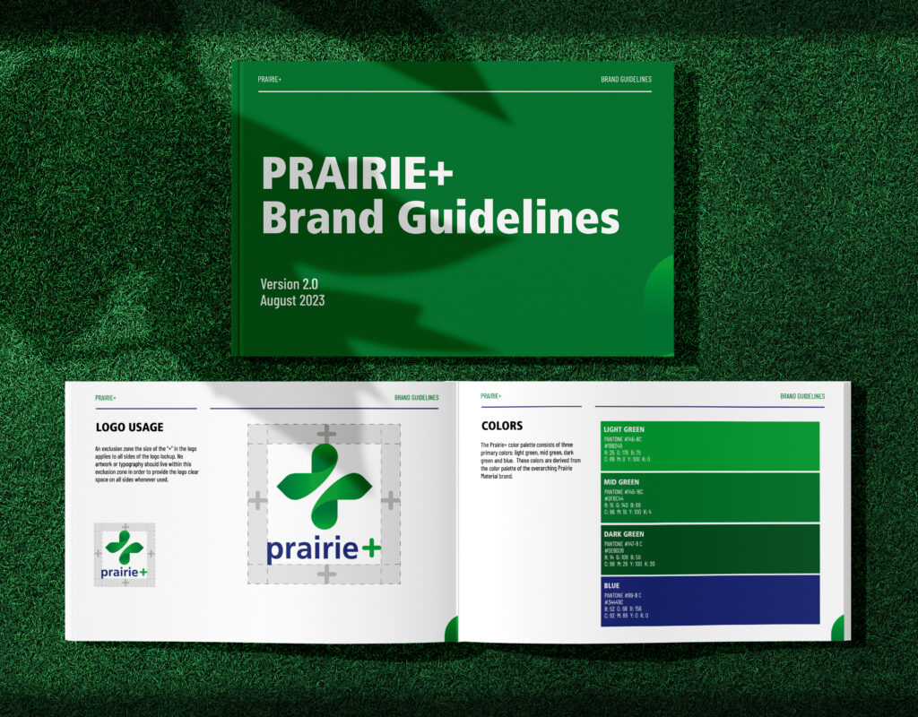
The primary Prairie+ logo is designed to highlight the future of construction sustainability, merged with the legacy of the Prairie brand. The large green symbol is built from two leaf shapes, curving to form a plus sign. The wordmark beneath it retains the iconic orange and green color palette of the original Prairie logo, but with adjusted hues to feel more modern.
The orange “plus” in the wordmark is also rounded for visual consistency with the larger leaf symbol above.
![]()
Other Logo Options and Rationale
This logo features a similar design to the winning version, but it uses different colors and heavier saturation that came across as more dated than the more muted version.
The font is a callback to an older version of the Prairie Materials logo with a modern twist, and a small leaf icon references the eco nature of the brand. Ultimately this option was ditched because the logo’s elements competed with each other and rendered it too cluttered.
This version received high praise from the client for its simplicity and the gradient and curves of the plus sign. But this logo was deemed too safe and—without the inclusion of the orange color—it lacked a visual pop.
Brand Color Concepts
When developing the color palette for Prairie+, VisualFizz had a few goals in mind:
- Stand out from the other brands in the space
- Incorporate green to signify sustainability and eco-friendliness
- Avoid intense colors like red
VisualFizz defined a fresh and inviting color palette and guidelines for use. The final palette reflects additional changes the VisualFizz team made to accommodate Prairie Materials’ major global rebrand.
Typography
The VisualFizz team wanted to ensure that the fonts chosen for Prairie+ portrayed the innovative nature of the brand.
Prairie+ brand typography consists of varying weights of Frutiger LT Std and Barlow Condensed. This pairing of sans-serif fonts allows for Prairie+ to feel more future-forward with every piece of messaging and communication.
VisualFizz also created typography usage guidelines as part of the brand guidelines.
Brand Guidelines Document
VisualFizz worked closely with the client to finalize all brand elements and ensure they complemented the umbrella Prairie Materials brand while also highlighting the company’s exciting new venture. Once finalized, the VisualFizz team delivered a brand guidelines document for use moving forward.
Brand Positioning and Messaging
Armed with extensive insights from the research and discovery phase, as well as invaluable client feedback throughout visual identity development, VisualFizz developed the following key brand positioning and messaging elements:
- Values
- Mission statement
- Product Value proposition
- Elevator pitch
- Brand messaging, include tone of voice
The VisualFizz team clearly defined Prairie+ as a brand, differentiated Prairie+ from existing Prairie Materials lines and the competition, and ensured that all positioning and messaging connected with key target audiences.
VisualFizz and Prairie+ landed on phrases such as “building a sustainable future” and “redefining sustainability” within the messaging to communicate a sense of reducing the company’s carbon footprint, all without compromising performance.
Go-to-Market Strategy and Robust Suite of Materials
To ensure Prairie Materials’ new brand grows sustainably and with control, VisualFizz created a cross-channel go-to-market strategy—complete with asset creation—to spread the word about Prairie+.
Cross-Channel Go-to-Market Strategy
VisualFizz collaborated with the Prairie Materials team to define and build a go-to-market strategy to seamlessly launch the new Prairie+ brand and incorporate it into the larger Prairie Materials family.
VisualFizz laid out three rollout phases for Prairie+ to follow:
- Phase 1: Internal launch
- Phase 2: External launch preparation
- Phase 3: External launch goes live
Together, we defined specific channels and deliverables to use to best communicate the new product offering to key internal stakeholders and external audiences. In addition to providing the strategy, creative direction, and execution for each asset, VisualFizz also created a timeline for the internal team to employ.
Best-in-Class Launch Deliverables
With a cross-channel strategy in place, VisualFizz created a range of on-brand deliverables to aid in a successful launch. In many cases, VisualFizz developed multiple versions of the creative for the client to use and edit as needed.
Each asset is outlined in its respective category below:
- Internal Training Materials
-
-
- Internal education decks
- Deck for Prairie Materials corporate employees
- Deck for Prairie Materials drivers
- Letter and email from leadership
- Internal education decks
-
- Sales Enablement Materials
-
-
- Beautifully designed, fully customizable presentation deck for the sales team to use, including:
- Overview of Prairie+ and the benefits to the client
- Template for adding team member photos and contact information
- Details about the tech and specific products
- Customizable product example slide
- Easy-to-digest RFP process
- Customizable case study slides
- Common FAQs
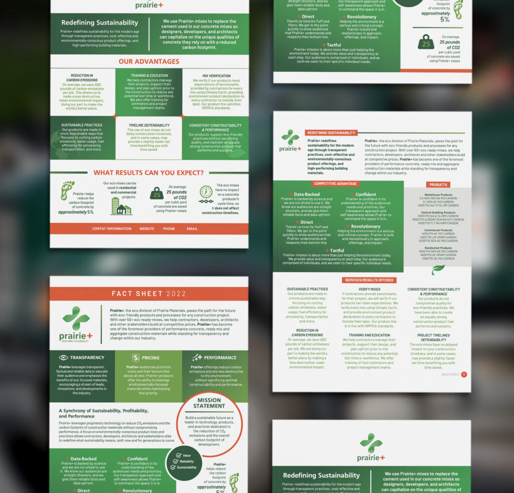
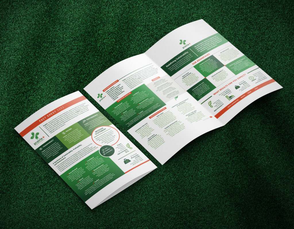
- Sales kit
- One-sheeter focused on advantages and results
- Fact sheet focused on values and mission
- Sales sheet focused on services, products, and FAQs
- Beautifully designed, fully customizable presentation deck for the sales team to use, including:
-
- External Launch Materials
-
- Explainer video about Prairie+
- Press release introducing the product
- Launch-based social posts and calendar for the team to share
- Whitepapers to showcase expertise
Results: A Client That’s Set Up for Success
The VisualFizz and Prairie Materials teams collaborated throughout the process during invaluable in-person meetings and presentations.
The team responsible for launching Prairie+ has been very happy with the quality and output of the branding and go-to-market work provided by VisualFizz. They feel confident moving forward with the materials created to communicate with internal employees, clients, and the public.
The VisualFizz team continues to partner with the overarching Prairie Materials on marketing needs.
Launching a Brand? Let VisualFizz Help
If you need creative support to bring your new brand or product to market, contact VisualFizz for a consultation today. We’d love to talk more about how we can help your business achieve its goals!