- First comprehensive brand refresh in almost 80 years
- Modern logo echoes parent company aesthetic
- Executed and rolled out on a tight timeline
Prairie Materials, a long-standing construction materials provider with roots stretching back nearly a century, needed a complete visual transformation. The leadership team sought an updated brand identity—one that celebrated the company’s history yet looked confidently toward the future.
VisualFizz executed the rebrand within a tight timeframe, rolling out the new look across the city and aligning it closely with Prairie Materials’ parent company, Votorantim Cimentos.
Services Highlighted in This Case Study:
Branding Challenges and Objectives
Prairie Materials had never undergone a substantial design overhaul, yet the timing was critical for staying competitive. After nearly eighty years of brand familiarity, customers and employees alike needed reassurance that new changes would reflect the company’s historical strengths.
The key objectives of the rebrand included:
- Honoring a Rich Legacy While Modernizing: Developing a brand system that retained Prairie Materials’ heritage while signaling innovation and future growth.
- Emphasizing Sustainability: Highlighting advances in reducing concrete’s environmental impact.
- Coordinating a Citywide Rollout: Swiftly updating every visible brand touchpoint—from signage to fleet graphics—on an accelerated schedule.
Rebranding Process and Implementation
Already a longstanding client of VisualFizz, Prairie Materials teamed up with our team to develop its first full-scale rebrand in decades, leveraging a more contemporary color palette and typography.
Rapid Discovery and Alignment
VisualFizz organized intensive research sessions with Prairie Materials stakeholders, examining the company’s storied past and mapping out brand goals. The team quickly funneled insights into a unified design direction to meet tight deadlines.
Designing with Eco-Consciousness
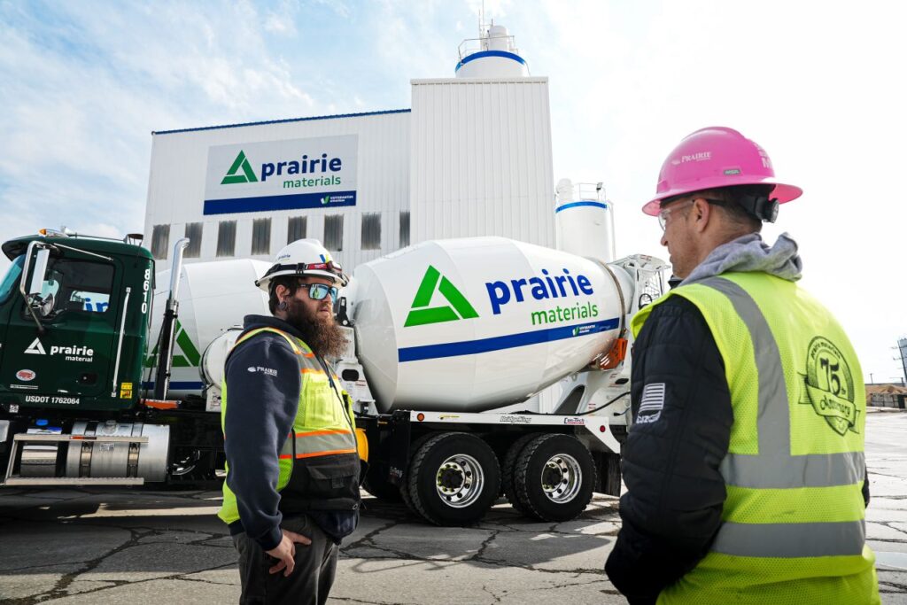
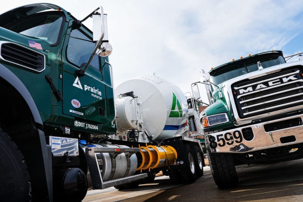
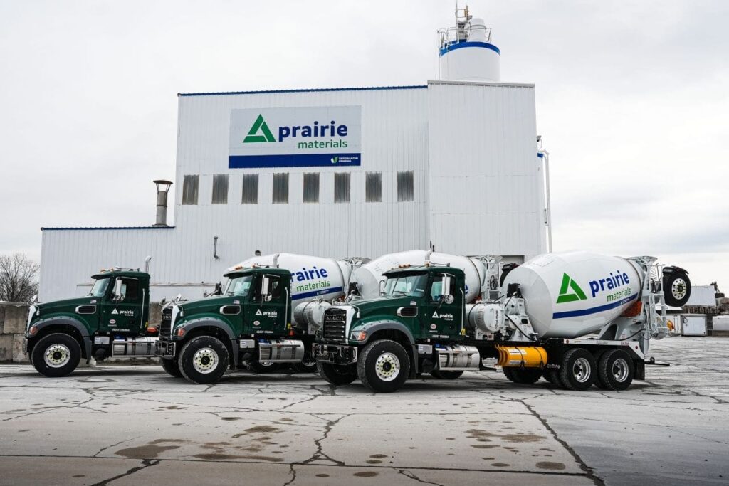
The centerpiece was a new logo inspired by the recyclability of concrete, paying homage to the parent company’s sleek, modern design language.
Matching the Parent Company
Prairie Materials’ parent company inspired a bolder, more contemporary color palette. VisualFizz produced versatile logo applications for every use case. The team explored multiple icon styles before landing on a final mark that captured Prairie Materials’ eco-forward message.

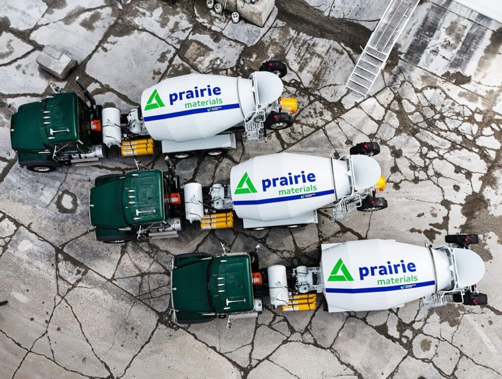
Citywide Brand Rollout
VisualFizz worked closely with Prairie Materials to deploy the new design across mixer trucks, signage, and marketing materials. By combining strategic design guidelines with clear communication, the rollout progressed efficiently and consistently.
Results from the Brand Identity Overhaul
- A Historic Overhaul, Delivered on Time: Prairie Materials unveiled its first major rebrand in 80 years, completed within an accelerated timeline.
- Brand Recognition & Newfound Energy: The refined visuals honored Prairie Materials’ legacy, energizing internal teams, customers, and broader stakeholders.
Even the most established brands can benefit from bold, future-focused design. With the help of VisualFizz, Prairie Materials solidified its place as an industry leader ready for the next century.
Strengthen Your Market Position with a Strategic Corporate Brand Identity
Interested in transforming your brand to increase market awareness and elevate engagement?
Don’t hesitate to reach out—contact VisualFizz for a consultation today. We’re excited to discuss how our strategic approach can help your business achieve its goals!